A. Create a Landing Page
LANDING PAGE LINK:
https://gopropromo.wishpondpages.com/claudia-apon/
B.
Consider the layout, use of colors, navigation, pictures, colors, etc. As you plan for the landing page, please evaluate your own landing pages by referring to the following questions again. Please answer the following questions in your mini-essay and then post the evaluation to your blog.
- What are the value propositions?
- What are the calls to action?
- What demographic are you trying appeal to? Do you think if you are doing a good job of that?
- Is it obvious and clear what you wants visitors to do to convert?
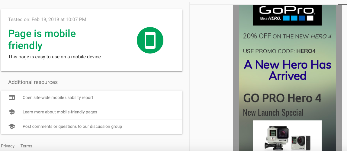
- Perform a Google Mobile friendly test (https://search.google.com/test/mobile-friendly ) and attach a screenshot of your result to your blog post. Is your site mobile friendly or not?
- Should I include this Assignment next semester? Why or why not?
My landing page started off with adjusting the colors to not be so bright to the viewers eye. I also wanted to reflect the company (GoPro) that it represented so I went with a grey/black/blu/white undertone. The value proposition I was aiming to do was attract and promote GoPro’s new product. I added information about how it was the best piece of technology the company currently had to offer and put the promo code in the Ad to push viewers to complete an online purchases. Promo codes are great for this reason because it makes people want to receive a deal rather than waiting and thinking about it. The actions to call were potentially getting the consumer to press the buy now button once they read about all the items included, the products features, and the great discount being offered for a limited time. It is obvious that this is what the intent of the landing page is for. The demographic I am trying to appeal to is potentially anyone who enjoys using a camera or let alone adventure. A lot of memories are difficult to capture when performing activities and the GoPro allows them to share with friends and family. Luckily, my page is mobile friendly. This is most likely because I included basic fonts, and didn’t include a ton of image backgrounds that would take a while to load. I think this assignment should be included next semester because it gives students the opportunity to try building somewhat of a website and test out their design skills. I think colors and font are a huge part on marketing and whether or not it’ll attract the users eye. Consistency and professionalism is key.