- What is the difference between web design and web development? Do you agree with the author of Purely Branded? Summarize at least three differences mentioned by the author. What does a web designer typically do? (You might want to refer to the following article: https://www.purelybranded.com/insights/web-design-or-web-development-whats-the-difference/ ).
The difference between web design and web development is web design revolves around the 5 design principles. These principles include: balance of the layout, contrasting of colors, emphasis of specific elements, consistency of design and the unity of the website as a whole. Web development is a, “non-interactive ‘picture’ of a website” (Purely Branded). The web development has to do with the internal side of a website. It’s the elements that actives links, and code to make the website function all together.
2. What does “upper fold” or “above the fold” mean? How does it affect readership?
“Upper fold” or “above the fold” on a website is the first thing that loads in the upper corner of the page. It is the part of the web page that is visible without the need to school so it needs to catch the readers attention. Without an eye-catching “upper fold” the reader may leave the site, thinking that it doesn’t have the information they are interested in. I can relate it to terms in writing like a hook. It needs to be interesting enough to make the reader want to learn more.
3. Read the following article on Mobile Friendly Test and summarize at least two points you recognize as a priority for mobile friendly web design.
Since a website wasn’t listed, I found this website as an article relating to the “Mobile Friendly Test”. https://support.google.com/webmasters/answer/6352293?hl=en
Two points the article states is that the website needs to be reachable and should be able to load all resources. If not, the viewer is not going to get the full experience and reason the wrong impression of the site. This tool can help a business owner test their mobile sites to be working accurately. As google says “most site owners lose half their visitors while waiting for a website to load”.
4. Test the speed and performance of the site of one of your client’s closest competitors and attach a screenshot of your result to your blog post. Is your client’s site mobile friendly or not? https://testmysite.thinkwithgoogle.com/
My client’s closest competitor is “Gorham Yoga Company” because the offer the same classes and are only located right down the road in Gorham.
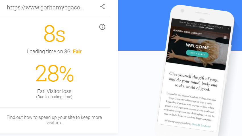
As for my client’s site, it did not want to load at all. I tried it on both my phone and computer. I am going to assume that its speed time and performance is lower than my competitors due to Google test even having a difficult time processing it.
5. Perform a Google Mobile friendly test of the site of one of your client’s closest competitors and and attach a screenshot of your result to your blog post. Is your site mobile friendly or not?
Using my competitor and my client’s site again, I decided to test which one was more “Mobile Friendly”.
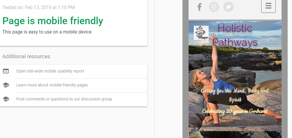
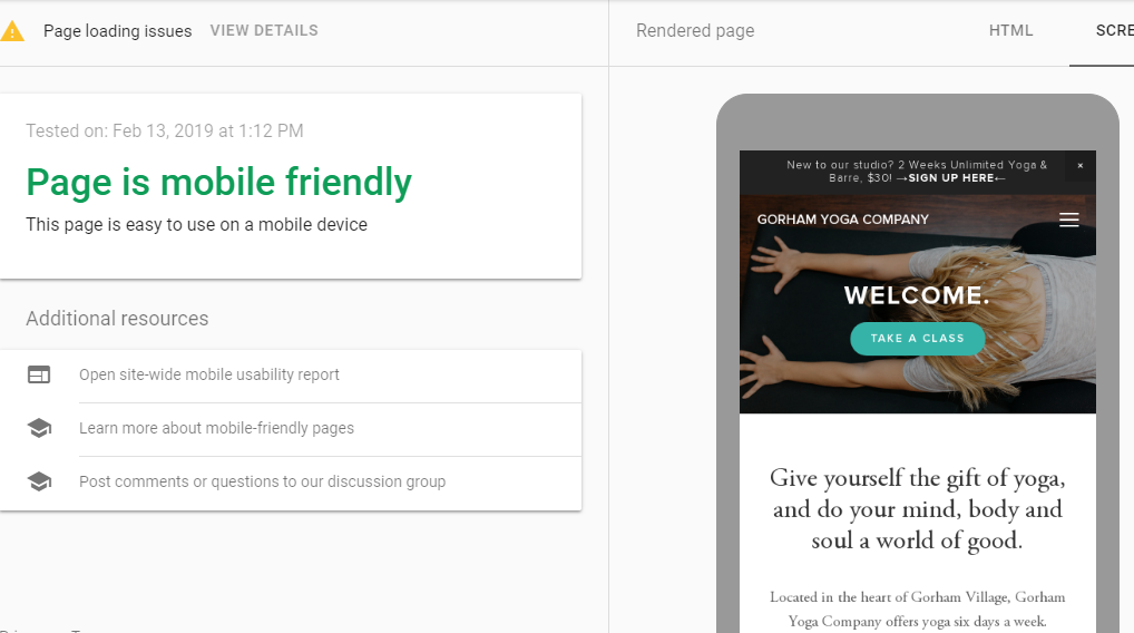
After performing the test, it looks like both sites are mobile friendly. However I did notice my competitor’s site was notified as not being able to open all resources. This could be an advantage to Holistic Pathways because if clients cannot reach all resources, they may turn somewhere else local.
6. You are asked to offer a short “critique” of a landing page that grabs your attention. As you browse the different landing page types at Adobe Spark (https://spark.adobe.com/gallery/), evaluate one of your favorite landing pages by referring to these questions:
The landing page I decided to do a short critique on was: https://spark.adobe.com/gallery/food/example/it’s-pau-hana-time/
I think I chose this site because it has food and drinks in the front image and just reminded me of a tropical vacation since it used the words “Pau Hana”. They chose to use the words “It’s Pau Hana time!” which made me feel like it was a happy celebration that I was interested about. Then they showed many pictures of the even and people having a good time. They made this landing page to spark other’s interest for the next time they do it. The demographic they are trying to appeal to is basically anyone who likes food and a good time. Specifically authentic BBQ. They show a lot of images of people smiling, the food being made and atmosphere at the event. It isn’t super obvious what they want visitors to convert, I am guessing it is so that they want to go to the event next time around. If I were them I would’ve added a link to their website so they could sign up to attend or create a raffle so they would participate and attend next year to see if they win.

